How to Design a Successful Hair Extensions Blog
How to Design a Successful Hair Extensions Blog
Would you like to make money with your passion for hair, but you do not want to sell? Or you want to save some money first before you open your store? In that case, inspire others with your love for hair and start a successful Hair Extensions Blog.
To make money with your blog it is not enough to write blogposts about hair. Or to share the best images of girls with weaves, braids or extensions. You need to seduce your audience to get from a relaxed reading mode to action. They need to click the right buttons or links to get what helps them and generates cash for you.
I will tell you how design will help you to create your own successful Hair Extensions Blog. Successful stands for an awesome user experience. Plus enough money to fulfill your goals.
Interesting enough? Please continue reading!
A successful hair blog design ends with the right colors
If you tell a story to somebody, you can use your hands or the tone of your voice to add emotion to your narrative. This directs your audience through the story and helps them to give the right reaction. Make them laugh by adding a funny face to a joke you told. Or get a standing ovation by making a deep bow, after you told a compelling story.
All this is not possible when you only show some letters on the screen, making words and sentences. You need to help your audience to take the right actions. Using colors to your hair extensions blog, or website.
Be aware. You need to know:
– which colors pair well with others,
– what color schemes are available to produce effective designs and
– which emotions each color evokes and communicates.
And avoid combining colors that give an uneasy experience to the visitor of your hair blog.
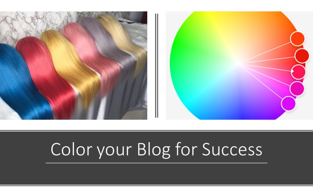
Use the color wheel for the design of your hair website
Having around 17 million colors at your disposal to use for your hair store or blog, it must be reassuring to know there is a structure that visualises the relationships between all these colors.
It all starts with three color groups to find countless vibrating color combinations:
– Primary
– Secondary and
– Tertiary
Primary colors
The first group everyone knows, this group consists of red, blue and yellow. These colors form the basis for all the colors we can see.
Secondary colors
This group of colors we all learned at nursery school. Mixing the three primary colors gave me at least a wide variety of other colors like green, orange and purple. I proudly took them home on my new shirt!
Tertiary colors
This group of colors forms when mixing a primary and a secondary color. This also gives lovely names, like Vermillion, Chartreuse and Amber.
From cool to warm colors
All colors have a warmth value assigned to them, classified as warm or cool.
Warm colors range between red and yellow. Which include various versions of those colors in addition to orange. This also comprises colors such as brown and tan. These are “warm” colors in that they suggest a sense of warmth. For instance, fire is associated with warmth, and it burns between the spectrum of reds and yellows. Warm colors can also promote a feeling of aggression and are considered bold.
Cool colors are given this designation because of their calming nature. They’re often associated with winter climates or water. These colors range between blue, purple and green. Most grey colors fall into the cool category as well.
Use the lightness of a color
When you increase or decrease the lightness of a color you will get various tints and shades of a hue. Tints occur when white is applied to a color. Shades, when black is added to a color.
Shift the attention of your blog visitor to the button you want them to click
Use the contrast, to play with colors that are opposite of each other on the color wheel. A button in a contrasting color draws the attention. If you have a buy button on a red page, make sure you subscribe or you buy now button is yellow.
Color palettes for your successful hair extensions blog
Enough theory, now it is time to show you how to make it work for your hair extensions blog.
The following call to action will open for you the color wheel.
You prefer a professional client friendly online hair store?
Now you can follow seven different schemes:
– Analogous
– Monochromatic
– Triad
– Complementary
– Compound
– Shades
– Custom
Analogous color schemes
Analogous, or comparable color schemes apply three or more colors that are next to each other on the color wheel. There is one dominant color, combined with a second to support, and a third to accent the color palette.
Analogous color schemes create a visually pleasing and calming display. But watch out, they do not provide much contrast.
Monochromatic palettes
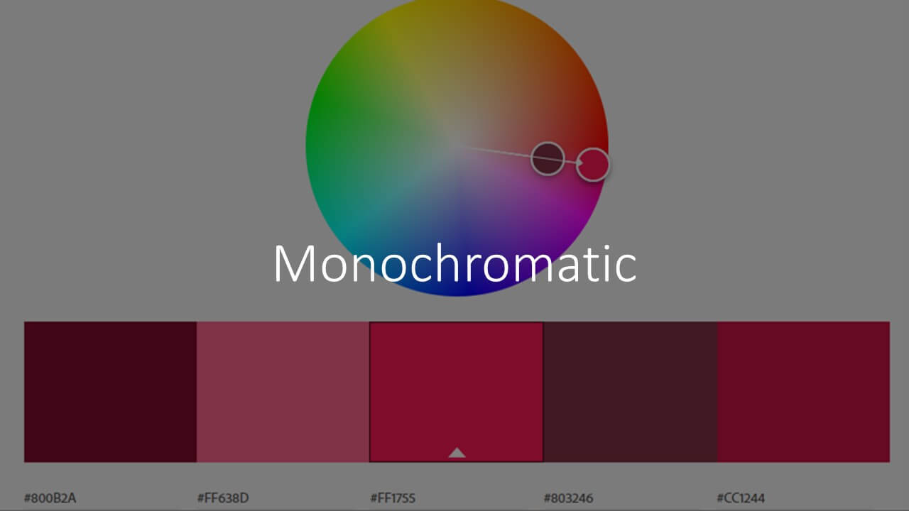
A monochromatic palette utilizes a single color with varying shades and tints. Each color is derived from the base color. This provides an immediate sense of harmony. You should use a contrast color to make it less monotonous.
Triadic Color Schemes
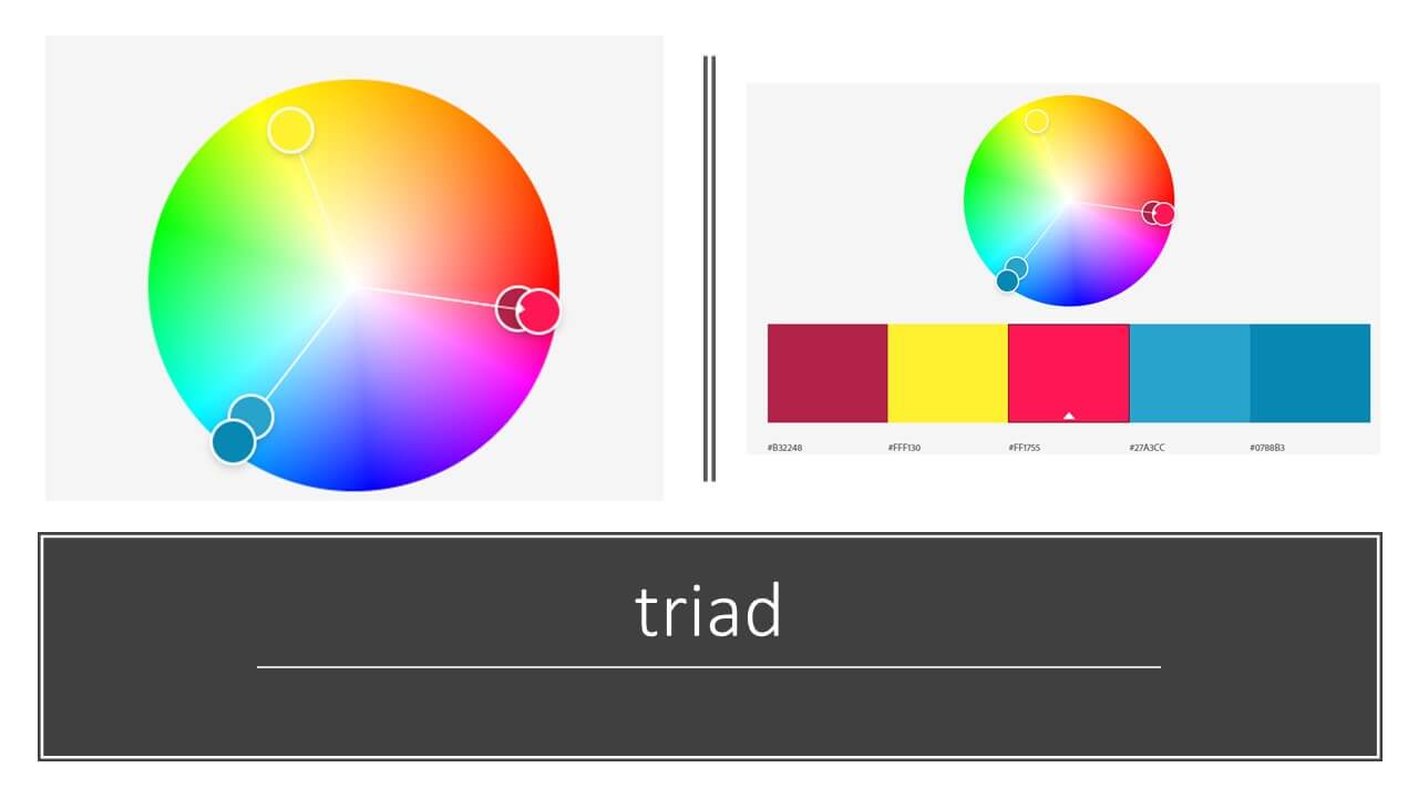
Triadic color schemes, much like complementary schemes, provide additional pops of color while allowing for some flexibility in the range you can use. These consist of three colors that are equidistant from each other on the color wheel.
Complementary color pallets
Colors that are opposite each other on the color wheel, known as complementary colors. The high contrast of complementary colors creates a vibrant look, especially when used at full saturation.
Compound color scheme
A compound color scheme is created when you choose a color and the two colors adjacent to its complementary color. While similar to a complementary color scheme, the addition of adjacent colors helps to create a more interesting color palette but with less contrast.
How do the visitors of your hair extensions blog or webstore react on colors?
Now you are a master in the color technique. And you understand the background and combinations to make or to avoid. So now you are ready for the psychology. How do the visitors of your hair extensions blog react?
Choosing the right colors can help you to communicate the context and emotion of a product or service to the visitor of your blog or webstore
Red: Passionate, energetic, angry
Orange: Optimistic, playful, fun
Yellow: Welcoming, intellectual, impatient
Green: Prosperous, balanced, growing
Blue: Peaceful, loyal, cold
Purple: Imaginative, royal, spiritual
Gray: Unemotional, compromising
White: Innocent, pure
Black: Luxurious, powerful
I recommend using this list of possible desired or undesired responses when you wrap up the mission statement of your hair business. See how your ideal client, and the hair they need aligns with the base color of your website or blog.
Red alert!
It can be attempting to mix colors until you have the most energetic and eye-catching combinations. But please be careful. Some combinations will scare your visitors away from your website.
Use neon colors sparingly. While the use of neon colors can feel hip, they are often hard on a user’s eyes.
Avoid vibrating colors. Vibrating colors result from pairing two colors with high saturation together that may be complementary to one another. It creates a glowing or moving effect, which also can be hard on one’s eyes.
Avoid color combinations with insufficient contrast, dark letters on a dark background for example.
Tips
Buy Now button
Use contracting colors to draw the attention to call to action buttons. Do not show your button in full color if the visitor still needs to finalize another action. Like to fill in a form.
Let the button change colors if the visitor hovers over the button. This will again draw the attention to the button.
We all like whitespace!
It is amazing what some extra whitespacing will do to the comfort of the reader of your blog. Experiment yourself to see how much more relaxed a piece of text is, when there is more white between the lines.
Start a successful hair extensions blog
Start your own blog and generate money as of day one while inspiring others with your views about the hair business. Your first day as a financially independent woman!

