Hair product page design that sells
The product page design for your hair store is one of the most important pages on your online store. It is clear it is important to know, how to make the product page a best seller? You want people, to buy your hair and beauty products. Read how you can design a page that converts the visitor of your webstore into a client! We visited and analysed product pages of 19 hair stores to help you to find the best design. A free lesson to make money!
19 stores
In our survey we included small and big hair brand names. Store like Indiquehair.com, Yummyextensions.com, stores that sell only wigs and stores that offer many hair products. We found many unique solutions but also a lot of generic elements. We will share with you some interesting lessons.
What you should know before you design a hair product page
When a user is visiting your website, she is not always there to buy the hair. It is possible she is only collecting alternatives to solve her hair problem. She knows she needs new extensions, but it could also be that a new wig could be a better solution. And if she has never bought a wig before, she first wants to understand what she must know about wigs.
In short, she is scanning your webstore. You have to offer enough links, buttons, text, or images to help her finding the right information. Therefore, it is important to define and understand your ideal client. You must know where she is looking for.
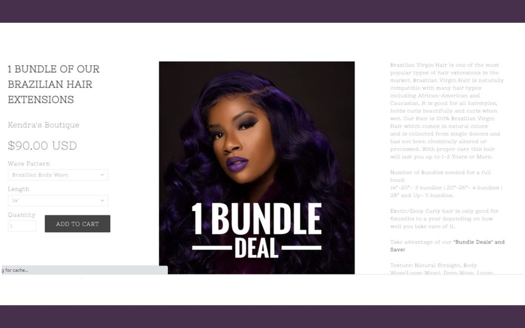
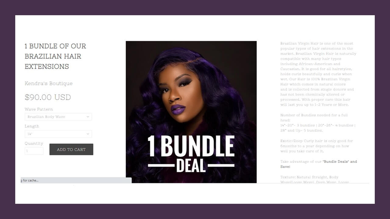
One out of four of the hair product pages support these visitors with extensive information. Not just a product description that consists of only a few bullets. These stores share a nice story about the hair, the maintenance, and the origin of the hair. For an example visit Kendrasboutique to see. Very educational. This text can be positioned direct near the product Image and the button to order the hair. But you can also find this educational story in a sperate tab, like YummyExtensions.
50% of the hair product pages only put some bullet points to tell the visitor about the hair. A few stores assumed their visitors know it all, because they did not share any additional information about the hair. The title of the product page and the variation they offered must be enough.
Tip: Add enough text to help your visitor to decide, use bullets and headers to allow quick scanning.
Make sure they do not forget your brand
Nearly all the stores understand visitors need to see their hair brand and the hair they offer multiple times before the client will buy the hair. Email is a great method to keep your contacts warm. Make sure you share interesting and fresh content or a regular basis, but not too often. Use the same colors and brand name as your logo and corporate colors. This way the brains of your newsletter subscriber will add you to the list of trusted sources. There are several methods used to have people to sign up:
- Add a sign-up button on the product page for your email list, published 42% times
- Use a pop up direct when people visit the site or with a delay, used by 42% of the stores
- A banner with 10% discount offer when people sign up for the newsletter, 16% of the stores
Add the link for the email sign up in the footer menu
But next to email, social media is also important to keep a warm relationship with your clients. Make it easy for your visitors to visit your social media pages. And yes, everybody still likes Facebook.
Tip: Add the sign-up form on your product page, like for example Indiquehair.com. When you use a pop up, make sure the visitor get’s some time to study the site before the pop up shows up. This way the visitor can make the decision if your store offers what they need. This will increase the conversion ratio for the email sign ups.
Reduce the options
Avoid information overload. Help your visitor to make the decision by reducing the number of options she must select before she can see the price of the hair. Most stores with 16,000 to 50,000 monthly visitors only showed one option (length). The product was already created by origin and texture, for example Indian Body Wave. Now your hair store visitor only must think of the length. This way you reduce the chance she will bounce away because there is too much to do. Studies have shown when people see too many options, they will forget about their problem.
Little support
A product page does not show much generic support, like a complete table with Frequently Asked questions. But a chat function is favourite by one out of four sites. You can still offer quick access to support and help when you add the pages with shipping info, FAQ, and other help pages in your footer menu. This despite the mantra from the experts in conversion is to limit the number of options to leave the product page.
Tip: One of the stores did publish a FAQ table, but all the information was blank. Check the page before you launch.
Cross selling on a product page
It is nice when the client buys a bundle deal, but what about a matching closure? 6 out of 10 stores added a related product section to the product page. This way people can make the complete picture of the hair solution they are looking for. And in one flow add the closure to their cart! One store even added the closure to the variations people can choose from.
Tip: Cross selling, the art of increasing the amount in the shopping cart can be very beneficial. Make sure you only pick products with a natural link to the other products. Otherwise, your visitor might start to rethink the whole purchase.
Ideas
Some stores had funny or interesting elements to the hair product page:
- A spinning wheel to win a discount on the next purchase
- Tabs for Description, Delivery, Length and Exchange Policy. This will limit the information on the screen, but with one click you inform the visitor.
- Product videos are really the thing. See how your vendor can help with some video’s
Tip: Avoid copyright issues and do not upload video’s with music that is protected by copyright.
Ready for your best selling Hair Product Page Design ?
Did you see elements you can add on your product page? Or did you learn from the big stores, to create a product page that has a flow your visitors are accustomed to?


